I personally never liked pop-ups. I always felt, popups were like throwing information at your readers face. Isn’t It?
However, data says otherwise.
- Entrepreneur.com in an article stated that they saw a whooping 86% increased conversions in newsletter subscriptions through pop-ups.
- In an article on crazyegg.com, George describes how Nikki McGonigal, a food craft blogger saw 1,375%  more subscribers through pop-ups as compared side bar subscription form.
- Danzarrella in his blog post shows data to support how his signup rate doubled with a popup
- A post on ConversionXL shows how WP Beginner went from typically 70-80 daily new subscribers to 445 – 470 new subs per day using popups
- In another test popups drove 1,375% more email captures vs. a sidebar opt-in form.
I could go on and on about how popups have actually worked and helped many bloggers, business owners increase conversions through email popups. After reviewing and studying over 50 popup sites I learnt the three key ingredients to a successful popup strategy.
i. The Copy & CTA
ii. The Design & Layout
iii. Mobile & PC view
Here are some of my favorite sites with popups who have nailed it with the choice of color, copy and overall design
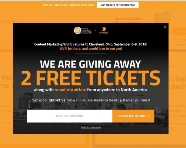
- Convince&Convert : Incentivise your readers
This is a great example of incentive based email collecting strategy. In this one Convince&convert is running a contest which needs readers to key in their emails to enter.
2. Kissmetrics : Play with CTA’sÂ
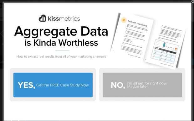
Kiss metrics’s pop up does a great job of capturing a readers attention without seeming too intrusive. Similar to Neil Patel’s blog the copy on Kissmetrics is very creative. The way the CTAs are created, a reader would definitely think twice before clicking “NO”. Here’s also a great article by them on 10 Ways to Capture Email Leads Without Disturbing Your Visitors
3. Lewis Howes : The double Popup
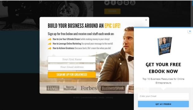
Lewis is a New York Times Bestseller and founder of a multi million dollar media company. His website has a clean look. What caught my attention were the two popups at same time. We have always seen and read that it’s best to offer one CTA per page to not confuse the reader and make action happen. But when I saw these two popups, as a reader,  I liked that I had a choice of either getting an e-book or signing up for regular updates.
4. Unbounce : Create Need or urgency
Unbounce is a landing page builder for marketers that helps to capture lead data and makes it easy for anyone to do A/B testing without any coding knowledge. The popup used by Unbounce has a crisp copy that creates a “need” in the readers mind. Sort of an urgency to receive the notes missed. Again do notice the two popups on this site too. 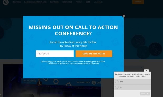
After gaining this understanding of email marketing and popup design, I have started to build my pop up strategy and am exploring the various wordpress plugins I could use to get this started. My current subscription rate is about 5-10 emails a day. I plan to double this by end of three month period. Any suggestions & inputs are welcome.
Meanwhile here is a list of WordPress Email Subscription Plugins I am studying for effective email marketing.
- WP-Leads
- Pippity
- OptinSkin
- Email Subscription Pop Up
- IcegramÂ
- Email Popup by Optin CatÂ
- Hellobar
- MailMunch – Grow Your Email Subscribers
- Optin Crusher
- Gravity Forms
If you are a user of any of the above plugins do reach out to share your suggestions & recommendations.
Tags: email marketing, email popups, increase conversions



Haven’t tried pop-ups on my site yet but I have a better understanding of how it can benefit it now ?
Haven’t tried a pop up before on my blog, hmm…am not keen as I personally don’t really to have pop up when am reading other blogs myself though
After reading your sharing, will consider it again since with plenty of benefits
Cheers, SiennyLovesDrawing
Wow! I hate pop ups too. But this post makes me rethink about my point and use pop ups in more fruitful ways..